
HubSync - сlosing the gap
between design and code
HubSync - сlosing the gap
between design and code
HubSync is a leading tax and accounting software company trusted by over 40% of the top 25 accounting firms in the US. I helped bring its enterprise platform to mobile, taking the experience from design through implementation.
HubSync is a leading tax and accounting software company trusted by over 40% of the top 25 accounting firms in the US. I helped bring its enterprise platform to mobile, taking the experience from design through implementation.
Connect to Content
Add layers or components to infinitely loop on your page.
2026
Design Engineer
Product Designer

Project challenge
Project challenge
The client came to us with an existing web platform and a two-month development window for a mobile MVP. The app needed to bring key document management workflows to mobile while staying consistent with the web product. The stakeholder presentation would help determine whether the project received further scope.
I had approximately one month to establish the mobile design foundation, with design and development overlapping to keep delivery moving.
The client came to us with an existing web platform and a two-month development window for a mobile MVP. The app needed to bring key document management workflows to mobile while staying consistent with the web product. The stakeholder presentation would help determine whether the project received further scope.
I had approximately one month to establish the mobile design foundation, with design and development overlapping to keep delivery moving.
Building every component from scratch would have left less time to implement and refine the core workflows. I evaluated UI libraries, selected one that fit our technical stack, and adapted its components to the web product’s visual language and mobile interaction patterns.
This gave development a reusable starting point. But a consistent design in Figma was only part of the challenge: the first working build revealed how much still needed to be resolved in the app.
Building every component from scratch would have left less time to implement and refine the core workflows. I evaluated UI libraries, selected one that fit our technical stack, and adapted its components to the web product’s visual language and mobile interaction patterns.
This gave development a reusable starting point. But a consistent design in Figma was only part of the challenge: the first working build revealed how much still needed to be resolved in the app.


Will we have enought time to polish the product?
Will it be 1 to 1 to what we have in Figma?
Will we have enought time to polish the product?
Will it be 1 to 1 to what we have in Figma?
Will we have enought time to polish the product?
Will it be 1 to 1 to what we have in Figma?
Delivery gap
Delivery gap
When the first working build arrived, the gap between the approved design and the implementation was immediately visible. Components that were consistent in Figma had different sizes, styles, and states in the app, while inputs and native elements behaved unpredictably. The product was functional, but it was not ready to present to stakeholders.
When the first working build arrived, the gap between the approved design and the implementation was immediately visible. Components that were consistent in Figma had different sizes, styles, and states in the app, while inputs and native elements behaved unpredictably. The product was functional, but it was not ready to present to stakeholders.
Instead of creating an endless feedback loop with engineering, I took direct ownership of the front-end quality. I worked closely with the developer, implementing and reviewing interface fixes while they focused on backend logic and integration. This expanded my role beyond design handoff and made me responsible for carrying the intended experience into production.
Instead of creating an endless feedback loop with engineering, I took direct ownership of the front-end quality. I worked closely with the developer, implementing and reviewing interface fixes while they focused on backend logic and integration. This expanded my role beyond design handoff and made me responsible for carrying the intended experience into production.
Notes
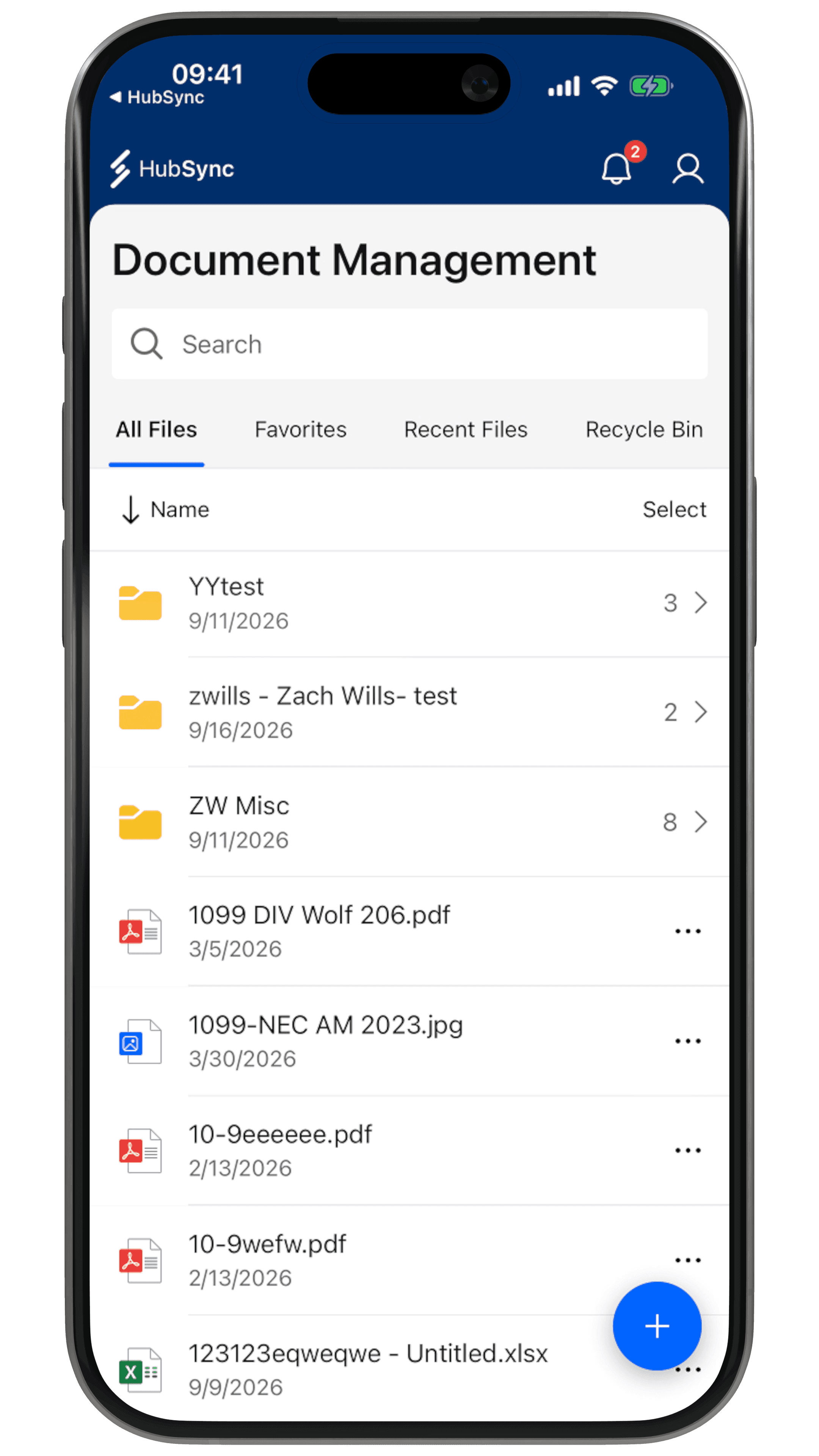
The home screen broadly matched the design, but visual inconsistencies and unfinished interactions still needed refinement.
Home
Move File
Native Elements
Invite

Original
First build
Notes
The home screen broadly matched the design, but visual inconsistencies and unfinished interactions still needed refinement.
Home
Move File
Native Elements
Invite
Original
First build
How I took visual QA beyond manual review
How I took visual QA beyond manual review
I began with a manual visual pass through the live app, flagging anything that felt inconsistent. This quickly revealed the limitation of reviewing by eye alone: subtle differences in spacing, sizing, and component states were easy to sense but difficult to verify without a reference.
Instead of logging isolated bugs one by one, I compared entire screens across three sources: the live app, the Figma designs, and the component code. I used Claude to analyze them and produce a structured report showing what matched, what differed, and where each issue originated.
I began with a manual visual pass through the live app, flagging anything that felt inconsistent. This quickly revealed the limitation of reviewing by eye alone: subtle differences in spacing, sizing, and component states were easy to sense but difficult to verify without a reference.
Instead of logging isolated bugs one by one, I compared entire screens across three sources: the live app, the Figma designs, and the component code. I used Claude to analyze them and produce a structured report showing what matched, what differed, and where each issue originated.
To make the process repeatable, I created a custom Visual QA skill that defined the comparison criteria and output format. I refined it until every report was concise and actionable, covering colors, typography, spacing, corner radius, component states, and interaction patterns.
Running an audit became simple: I provided a Figma frame link and, when available, the corresponding path in the codebase. Claude accessed the design through Figma MCP, applied the Visual QA skill, and returned a structured report that I could turn directly into Jira tickets.
To make the process repeatable, I created a custom Visual QA skill that defined the comparison criteria and output format. I refined it until every report was concise and actionable, covering colors, typography, spacing, corner radius, component states, and interaction patterns.
Running an audit became simple: I provided a Figma frame link and, when available, the corresponding path in the codebase. Claude accessed the design through Figma MCP, applied the Visual QA skill, and returned a structured report that I could turn directly into Jira tickets.

Wrong
icon color
Inconsistent
button styles

Invalid
icon size




Finding the Bugs Was Only Half the Job
Finding the Bugs Was Only Half the Job
With the issues documented in Jira, I began fixing them one by one using Claude Code. Each ticket became a focused task: identify the relevant component, explain the mismatch, and bring the implementation back in line with Figma. Claude handled file navigation and code edits, while I defined the expected result.
Before starting, I used CLAUDE.md to give Claude context about the project’s structure, frameworks, and conventions. This provided a shared reference for subsequent tasks instead of relying on instructions scattered across conversations.
With the issues documented in Jira, I began fixing them one by one using Claude Code. Each ticket became a focused task: identify the relevant component, explain the mismatch, and bring the implementation back in line with Figma. Claude handled file navigation and code edits, while I defined the expected result.
Before starting, I used CLAUDE.md to give Claude context about the project’s structure, frameworks, and conventions. This provided a shared reference for subsequent tasks instead of relying on instructions scattered across conversations.
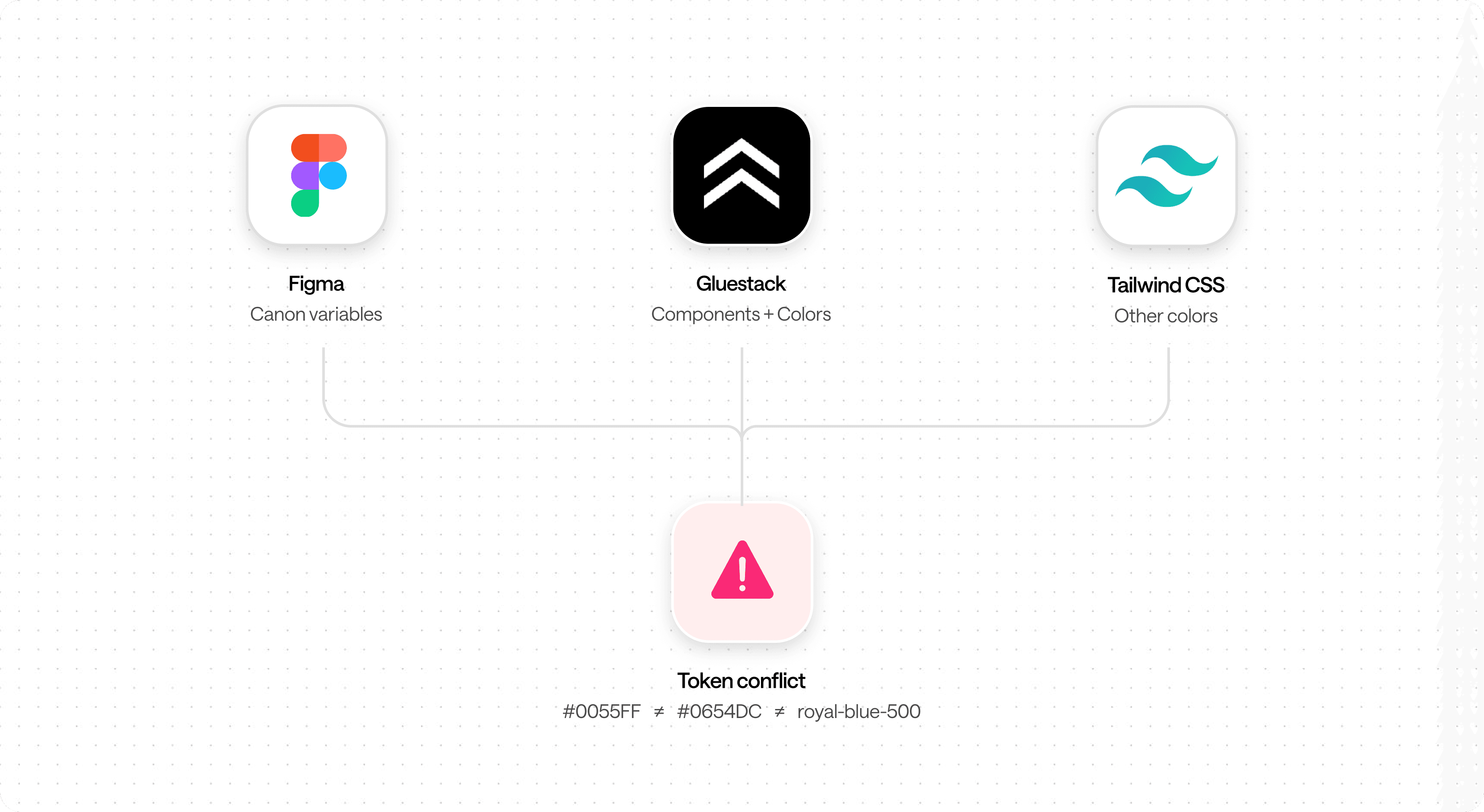
The codebase relied on three sources of color tokens:
Gluestack (components and tokens)
Tailwind UI (tokens)
Custom tokens (Figma design system)
Simply asking Claude to replace individual tokens would leave the underlying inconsistency unresolved. I instead aligned the existing tokens with the Figma variables and migrated components to a single source of truth. Once the migration was complete, unused tokens could be marked as deprecated.
The codebase relied on three sources of color tokens:
Gluestack (components and tokens)
Tailwind UI (tokens)
Custom tokens (Figma design system)
Simply asking Claude to replace individual tokens would leave the underlying inconsistency unresolved. I instead aligned the existing tokens with the Figma variables and migrated components to a single source of truth. Once the migration was complete, unused tokens could be marked as deprecated.
It started in Figma. It ended with a commit.
It started in Figma. It ended with a commit.
In two weeks, I brought the mobile interface close to pixel-perfect alignment with Figma and consolidated three color-token systems into one shared source. What began as a design assignment became hands-on responsibility for the implemented experience, working alongside the developer to close the gap between the designs and the app.
In two weeks, I brought the mobile interface close to pixel-perfect alignment with Figma and consolidated three color-token systems into one shared source. What began as a design assignment became hands-on responsibility for the implemented experience, working alongside the developer to close the gap between the designs and the app.
The biggest shift was learning to direct implementation, not just describe what needed fixing. Claude handled code changes, but I remained responsible for the design decisions and reviewing the results. Clear project conventions, repeatable audits, and careful review made this possible. AI expanded what I could deliver; it did not replace my judgment about what was ready to ship.
The biggest shift was learning to direct implementation, not just describe what needed fixing. Claude handled code changes, but I remained responsible for the design decisions and reviewing the results. Clear project conventions, repeatable audits, and careful review made this possible. AI expanded what I could deliver; it did not replace my judgment about what was ready to ship.
Notes
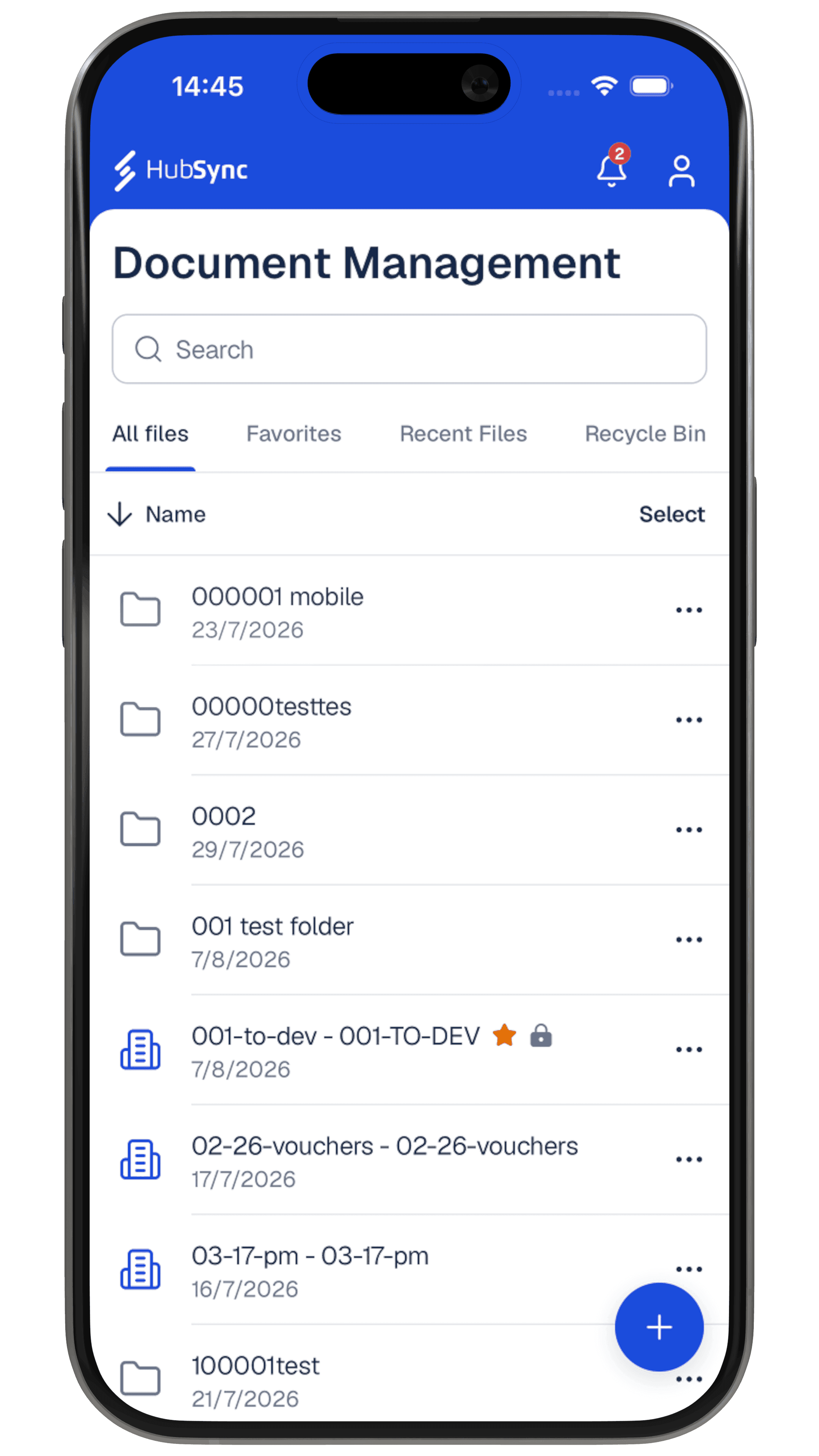
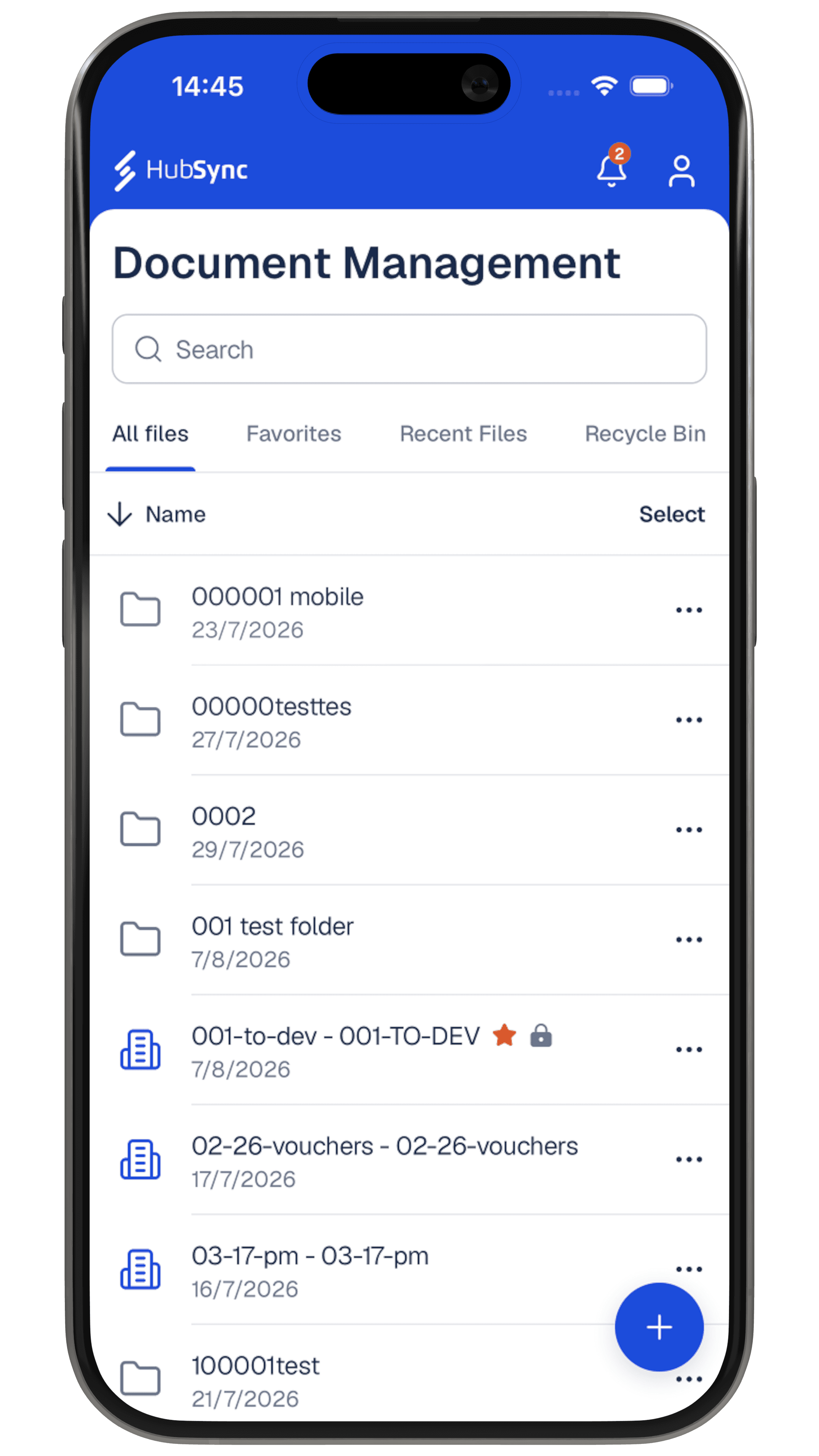
Beyond visual alignment, I refined navigation, interaction behavior, and feedback to make the app feel more coherent and responsive. The screens below show selected examples of that broader transformation.
Home
Move File
Native Elements
Invite
First build
Final result

In two weeks, I overhauled the mobile experience and prepared the MVP for a successful stakeholder demo that helped secure the next phase of work




Outcome 01
One consistent mobile design foundation
I brought competing component styles and color-token sources into alignment with the Figma design system. Shared rules for controls, spacing, and states made the mobile interface more consistent and gave the team a clearer foundation for future development.
Outcome 02
A successful demo.
A next phase of work.
The improved MVP was presented to stakeholders as part of the decision on further project scope. Their positive response helped secure the next phase, and our team continued working on the product.
In two weeks, I overhauled the mobile experience and prepared the MVP for a successful stakeholder demo that helped secure the next phase of work
Outcome 01
One consistent mobile design foundation
I brought competing component styles and color-token sources into alignment with the Figma design system. Shared rules for controls, spacing, and states made the mobile interface more consistent and gave the team a clearer foundation for future development.
Outcome 02
A successful demo.
A next phase of work.
The improved MVP was presented to stakeholders as part of the decision on further project scope. Their positive response helped secure the next phase, and our team continued working on the product.
In two weeks, I overhauled the mobile experience and prepared the MVP for a successful stakeholder demo that helped secure the next phase of work
Outcome 01
One consistent mobile design foundation
I brought competing component styles and color-token sources into alignment with the Figma design system. Shared rules for controls, spacing, and states made the mobile interface more consistent and gave the team a clearer foundation for future development.
Outcome 02
A successful demo.
A next phase of work.
The improved MVP was presented to stakeholders as part of the decision on further project scope. Their positive response helped secure the next phase, and our team continued working on the product.


HubSync - сlosing the gap between design and code
HubSync is a leading tax and accounting software company trusted by over 40% of the top 25 accounting firms in the US. I helped bring its enterprise platform to mobile, taking the experience from design through implementation.
2026
Design Engineer
Product Designer